BP · DESIGN ENGINEERING & SYSTEMS
bpCore: Rebuilding bp’s Global Design System
Transforming a fragmented UI ecosystem into an AI-native, tokenized single source of truth for 200+ designers and 600+ developers globally.
ROLE
Senior Design System Designer
TEAM
2 Senior designers · 2 Junior Designers
SCALE
200+ Designers · 600+ Developers
STACK
Figma · ShadCN · Tailwind · Azure DevOps · Claude
01 / EXECUTIVE SUMMARY
Challanges and goals
At bp, digital products span complex enterprise tools, commercial energy platforms and consumer-facing applications. Product delivery was constrained by a disconnected and broken design system that could not meet requirements for scale, flexibility or accessibility. As most senior Product Designer with enterprise design-system architecture experience, I guided the core team to rebuild, tokenize and modernize the system into bpCore — a multi-brand foundation ready for AI agents and modern frontend frameworks.
Overengineered libraries
Sub-systems operated in silos with inconsistent component logic and duplicate UI sets.
Detaching culture
Designers detached components because system assets were rigid, broken, or unsupported for complex edge cases.
Broken foundations
Without proper tokenization and theming, teams could not change density, dark mode or brand details without unmaintainable forks.
02 / STRATEGIC LEADERSHIP & ENABLEMENT
Create the operating model, then enable the people inside it.
Skill Matrix & Task Distribution
Established a team skill matrix across tokens, layout mechanics, documentation, and developer handoff. I owned complex component architecture while mentoring junior designers through advanced Figma execution.

Cross-Functional Feedback Loops
Organized hands-on scaling workshops to standardize variants, auto-layout protocols, and slot-based composition rules across federated product branches.


03 / PRIMITIVES & TOKEN SHOWCASE
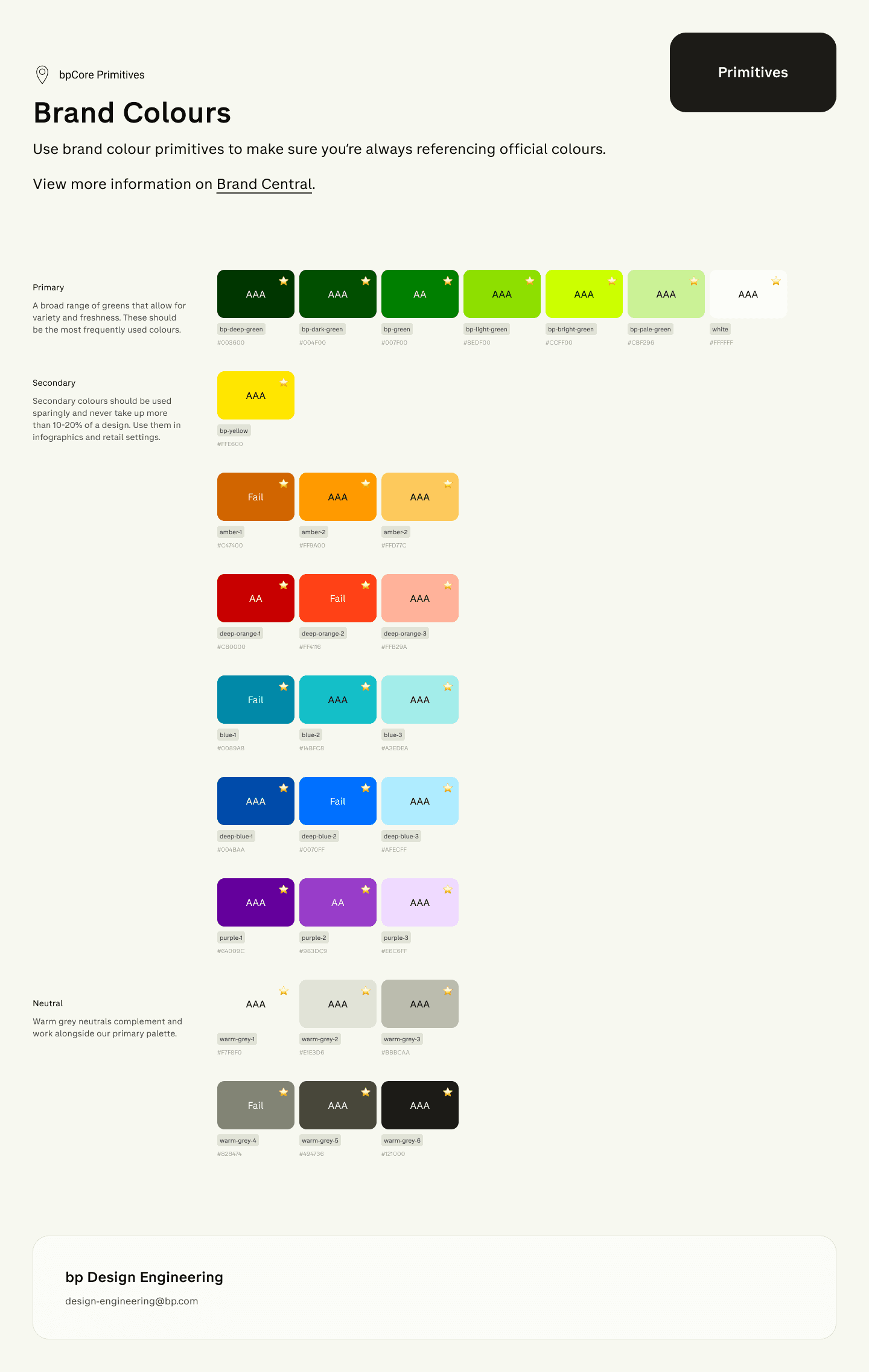
Strict foundations for accessible, flexible product delivery.
The bpCore foundation established tokenized design primitives for accessibility, flexible typography scales, and a predictable 2px spatial grid.


04 / COMPONENT ARCHITECTURE
A component system designed to stay connected.
Components were rebuilt with modern Figma mechanics: slot-based sub-templates, prop-driven variants, auto-layout flex rules, and dark mode states that mapped cleanly to engineering implementation.


05 / ENTERPRISE OUTCOMES & VALUE
A design system that improves how the enterprise ships.
New bpCore benefits — our centralised UI saves time while driving a unified visual language.
Designed for Figma
Slot-based composition for flexible molecules and organisms. Full theme control through extendable token collections. Dev handover via code connect for all components through Figma MCP. Simplified variants using props and sub-components.
Integrated with bp
Brand and accessibility compliance that meets EAA and brand guidance. Federated by design for sub-systems and kits. Planned starter templates aligned to standard repositories. Centralised distribution via Azure DevOps CodeAlign and Yalla.
Built for AI
A ShadCN-native, AI-optimised library with clear component ownership. Modular, responsive components with slots. Reduced context windows through fewer components and theme-driven customisation. AI-first documentation tailored for coding agents.

Back to Selected Work